10 eCommerce Best Practices for Your Category Pages
This is the next part in our Best Practices series for eCommerce usability. We have covered topics ranging from the homepage to product pages, to the shopping cart and checkout processes. It’s not uncommon for well-meaning web designers to hurt their eCommerce efforts by overdesigning pages or missing small details. We wanted to create a guide for designing your site so that you can show off your products in their best light. When you remove barriers to buying, your customers will have no reason to bounce. The final part of our Best Practices series covers category pages. These are the backbone of your eCommerce site and serve as a bridge between your homepage and product pages.
Check out these 10 best practices for using category pages to move customers deeper into your sales funnel.
1. Establishing Category & Sub-Category Pages
You need category pages along with subcategory pages. Some people want a high-level view of a category before narrowing their search. Most customers use this as a solution when they can’t find what they’re looking for or want to browse different options.
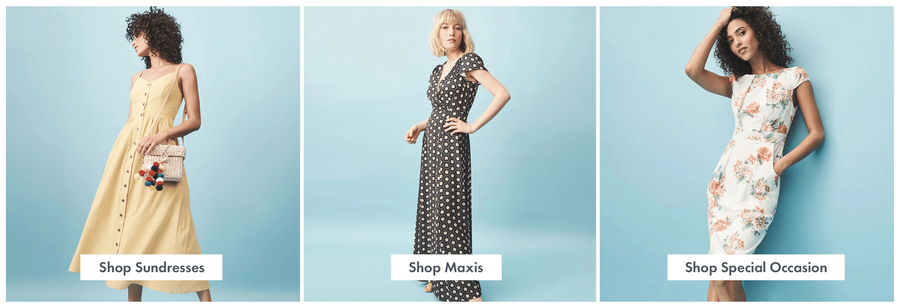
Let’s use the example of someone shopping for dresses online. A customer may not have a preference for an A-line or maxi dress; they just want to see what products you have and if they’re appealing. By creating a clickable “dress” category page, your customers can view all of their options and filter down the information based on what they like.
For example, ModCloth has a wide selection of dresses; many customers add dozens of items to their wishlist. ModCloth’s high-level category pages encourage browsing, not unlike looking at items in a brick-and-mortar location. Without this parent category, your customers will get annoyed and bounce rather than view each subcategory until they find what they need.
2. Give Customers the Ability to Filter
Your category pages give customers a high-level location of where they want to be, and your filters can help them narrow their options until their search results are more manageable.
Let’s use the dress example again. When staring at hundreds of dresses on the high-level category page, a customer can narrow their search results to a few dozen by limiting the price, size, length and color. With just a few clicks, they can focus on the best dresses possible for their needs.
Once again, ModCloth excels. Their site has more than 300 dresses, but that number drops to 99 when you filter by size. It drops again down to five if you filter by color. With these filters, it doesn’t matter what the dress category is because the customer finds their best options with just a few clicks.
3. Add Subcategories Multiple Times as Needed
This is one of the more contested tips when it comes to category pages. Some marketers argue that showing the same subcategories under your main categories will confuse customers, but studies have found that people actually find what they’re looking for faster.
For example, if you were looking to buy boys’ pants, would you go to the pants category first or the children’s clothes category? It’s unfair to assume that all of your customers think like you and will follow your same train of thought. Placing boys’ pants under both the pants and the children’s categories increases the chances that customers will find what they’re looking for.
Remember, your customers likely aren’t studying your categories like a map. As soon as they find what they want, they will click. This is particularly important for brands with dozens of categories, subcategories and even additional child categories underneath that. It’s up to you to decide whether this creates unnecessary clutter, especially if you have multiple subcategories that can go to various places. It may be worthwhile to implement usability testing for this to see how your customers react.
4. Make Your Categories Obvious for Users
Don’t let your brand get in the way of usability. It’s all too common for eCommerce brands to create “cute” category names that they think are witty but really confuse customers. Your category pages should correlate to how new customers view your website.
There are certain pages that every website has that internet users expect to find. Pages like “contact us” or “about.” When customers can’t find what they’re looking for, or when it takes a few extra steps to get there, they’re going to get annoyed with your site. The same concept applies to the colors of your products. Is “cloudy sunrise” supposed to be blue or orange? And if orange, what kind of orange? Clearer labels will sell better than overly branded content.
5. Use Consistent Product Images
We’ve touched on the importance of having unified branding for your photos on product pages, but this advice bears repeating: If you have multiple photography styles for your products, your customers will think less of your brand. Plus, you’re setting your site up to sell certain products that are displayed well while putting other products at a disadvantage. It’s worth the investment to take your own product photos instead of relying on your vendors to provide them for you. While you can use some vendor photos in your product pages, make sure the category image has your branding. Otherwise, your website will look like an eBay search results page.
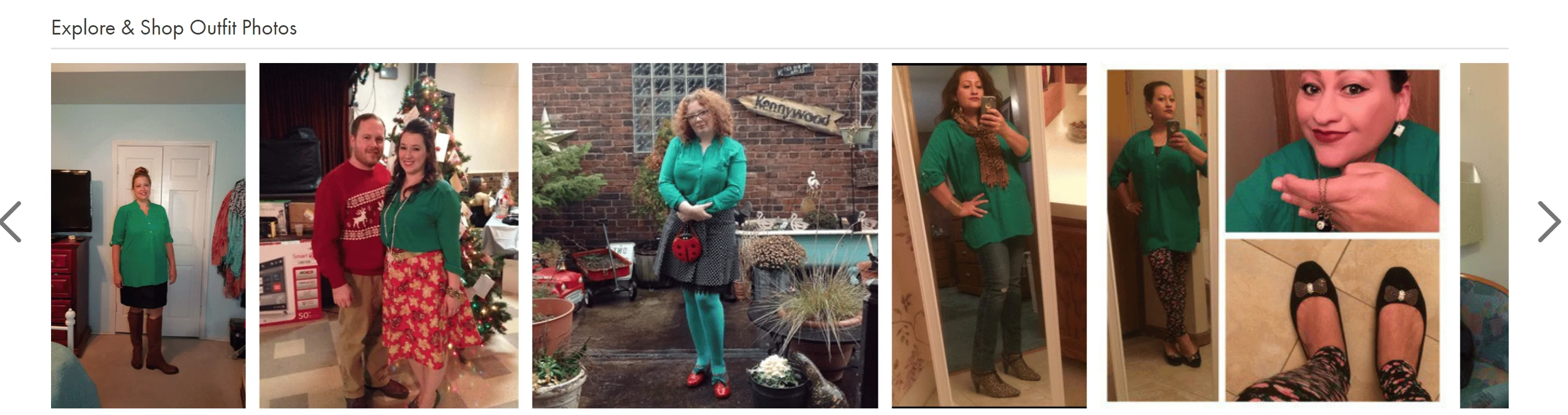
6. Display Product Reviews on Your Landing Pages
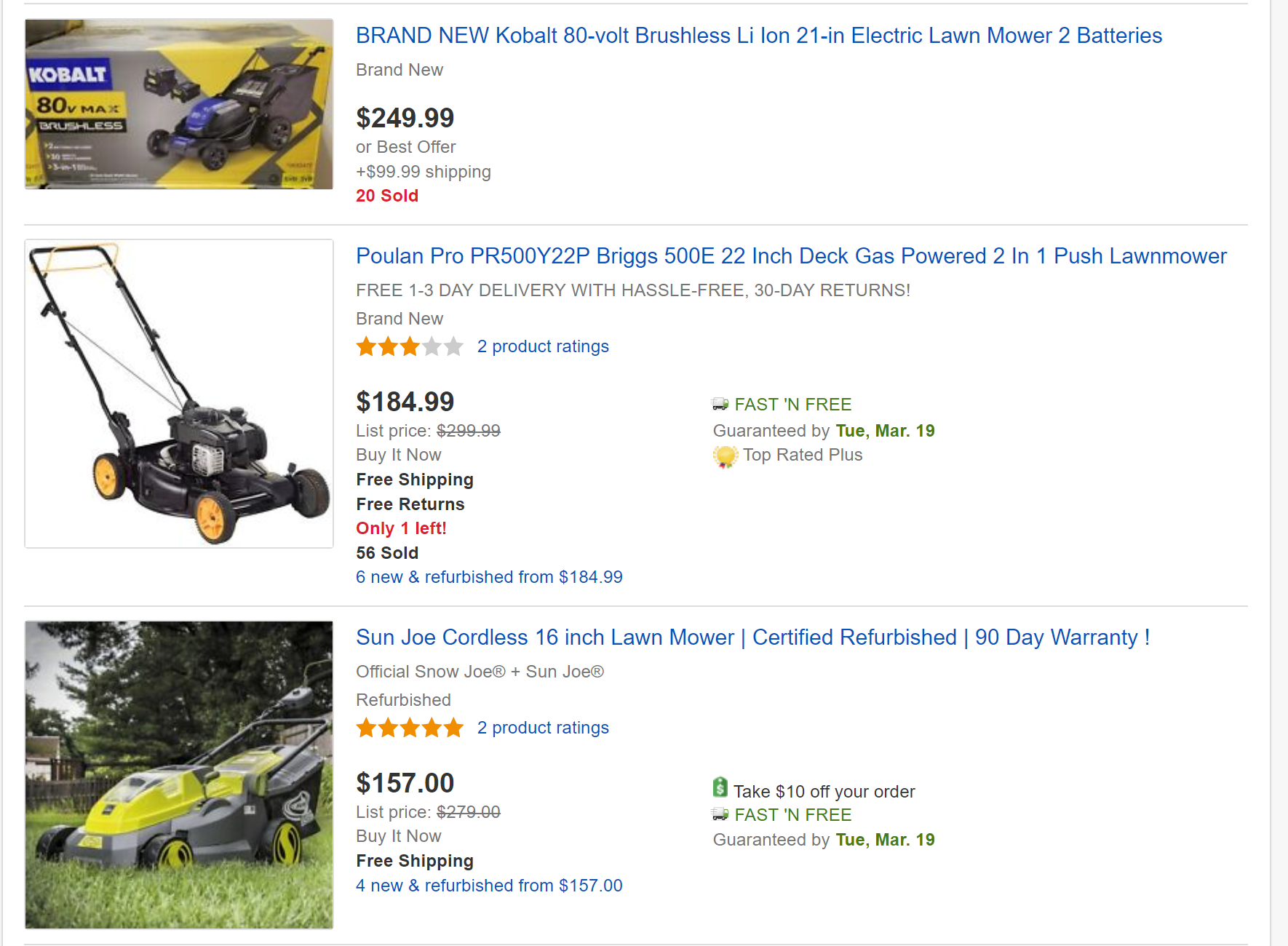
The goal of UX is to create a funnel for customers to move through your site to the products they want. While you can’t always predict what customers want, you can highlight the top options on your site. To guide customer clicks, include the number of reviews and star ratings for products on your category pages. People are more likely to trust items with several reviews and will click on your highest-quality items.
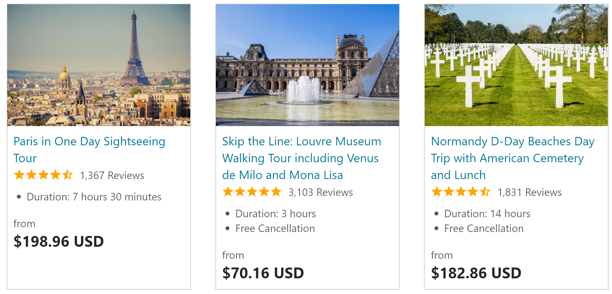
Consider this data: products that have 50 or more reviews convert at a 4.6% higher rate than those that don’t. However, customers only read one to three reviews before making a decision. The travel site Viator highlights reviews in all of their tours. Few people are willing to take a risk on a new tour or low-rated tour, so the top tours get booked quickly, and their reviews pile up.
7. Display the Product Price
Along with displaying reviews, display the price, as well. Don’t force customers to click on products that might be out of their price range. If you’re going to let customers sort, make the price obvious. By displaying the price, you’re actually bringing customers closer to the items they want to buy instead of requiring them to look at every product option on your site.
8. Make the Customer Path Clear
This is a small step you can take to make the customer navigation process easier, especially for people who aren’t sure about what they need or where to look for it. Adding a navigation path explaining how customers reached a certain place makes it easier for people to backtrack or get their bearings.
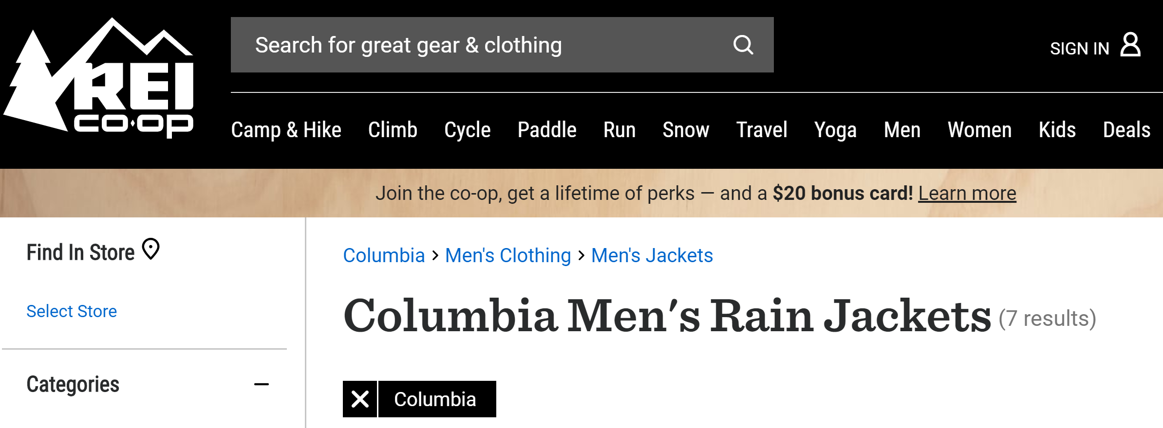
Let’s turn to REI for examples of both the clear customer path and multiple options for accessing subcategories. First, you can clearly see the path to reach your narrowed search results: Columbia > Men’s Clothing > Rain Jackets. However, that isn’t necessarily the path most people will take to get there. You can get the same results by searching for Rain Jackets > Men’s Jackets > Columbia. It doesn’t matter how customers find the content; all roads lead to high-quality results.
9. Promote the Latest Arrivals to Loyal Customers
If you differentiate your results between new and returning customers, consider adding a feature to your category pages that displays the latest arrivals to returning customers. These are people who already trust your brand. They wouldn’t have returned unless they liked what you have to offer.
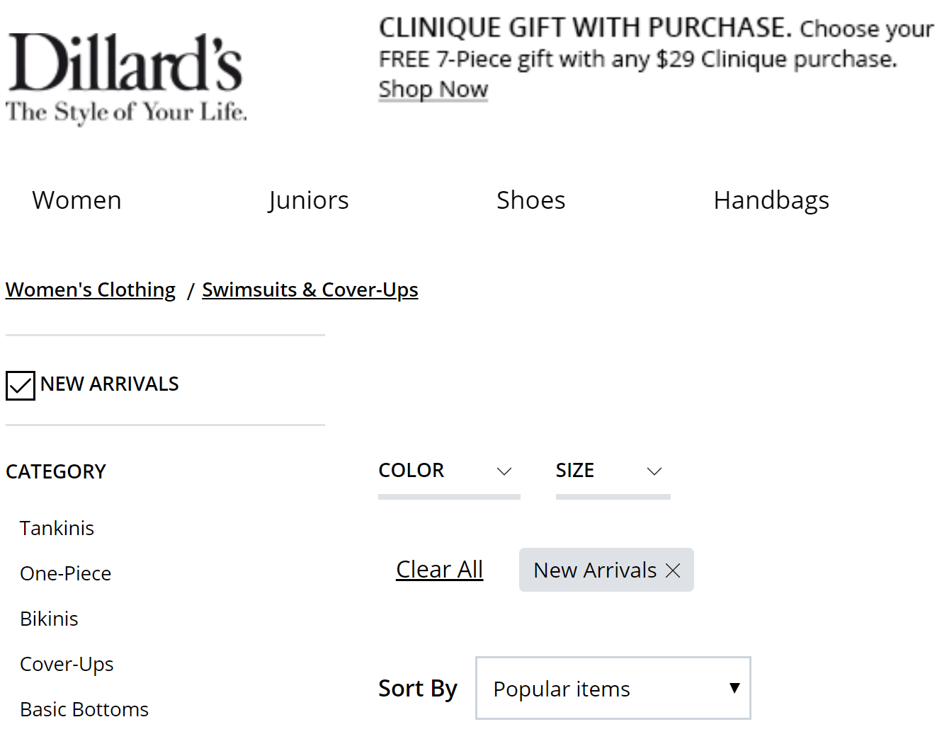
Instead of trying to push your best sellers and highest-rated items, showcase some of your new and fresh arrivals. When your loyal customers buy these items and review them, they can turn into your best sellers that new customers love, as well. At the very least, you can add a New Arrivals filter to your product listings like Dillard’s.
10. Ensure Your Pages Load Quickly
Online stores for Amazon and Walmart have trained customers to expect hundreds of results immediately. Your customers don’t want to choose between two options; they want to see dozens of products and filter them based on their needs.
If you have a slow load speed, your page might load four results and then sit half-finished for the next five seconds while the remaining items load. Prioritize site speed for a better UX, improved SEO and higher conversion rates. Remember, 47% of customers expect your website to load in under two seconds. Hold your feet to the fire and keep your load speeds up.