Call to Action Buttons: Analysis of Top eCommerce Companies
Do you ever wonder about similarities in how top eCommerce companies use CTA buttons? OuterBox has studied a large group of top eCommerce brands and how they use their Call to Actions (CTAs).
In this blog post, we take a look at how CTA buttons have evolved for today’s online shoppers. We also explore commonalities in how CTAs are used on these sites and what can you learn from them to boost conversions on your own site. Let’s get started.
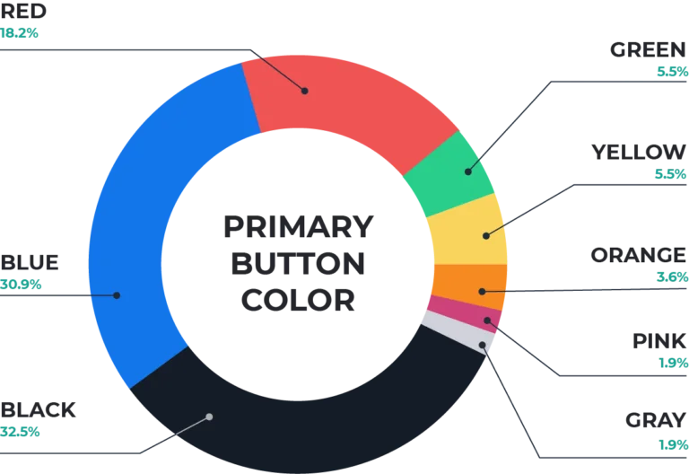
Primary Button Colors
All About That Contrast
A little contrast can go a long way. Which CTA below is easier to notice: the blue or pink button?
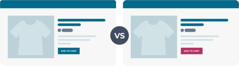
You probably found the pink CTA easier to notice. The easier a user can find their next step on your website, the better. As long as you’re consistent in your branding, a little contrast in button color makes CTAs more compelling. Many top brands use contrast well in their CTAs.
Spooooky Secondaries
A button styled with an outline and plain text is commonly referred to by the nickname “ghost button.” Many top eCommerce companies utilize this button as a “Save for Later” option alongside an “Add to Cart” option.
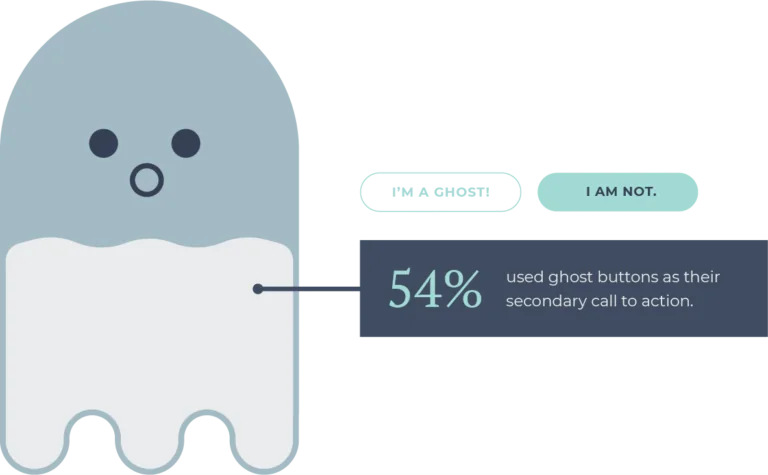
The subtle aesthetic of the ghost button makes it ideal for usage as a secondary call to action. They don’t overwhelm the intended primary action, and they easily to fit in with almost any brand style.
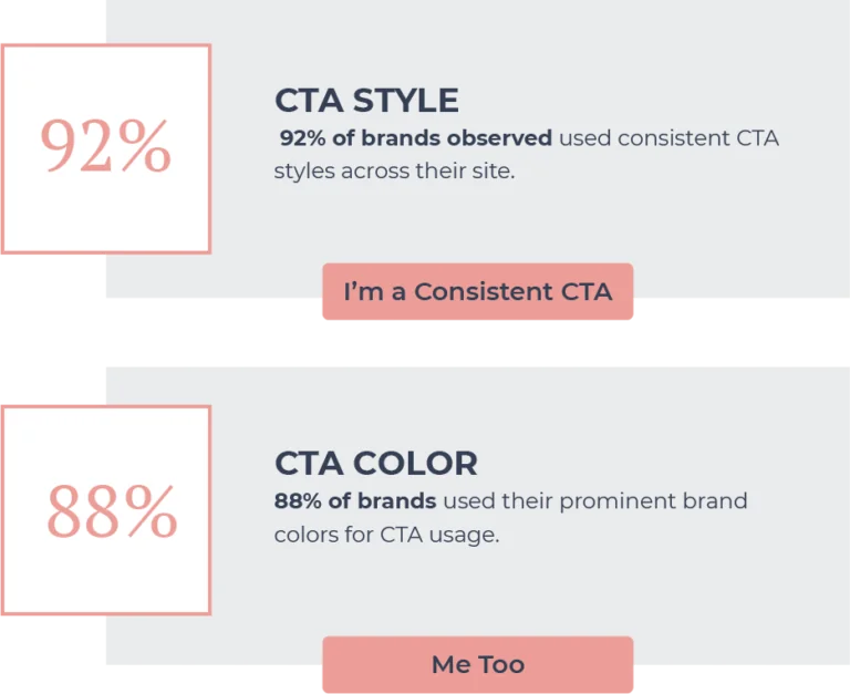
Brand Consistency
Consistency in branding is as important as it gets. Using consistent, prominent brand colors and styling over time develops brand recognition and loyalty.
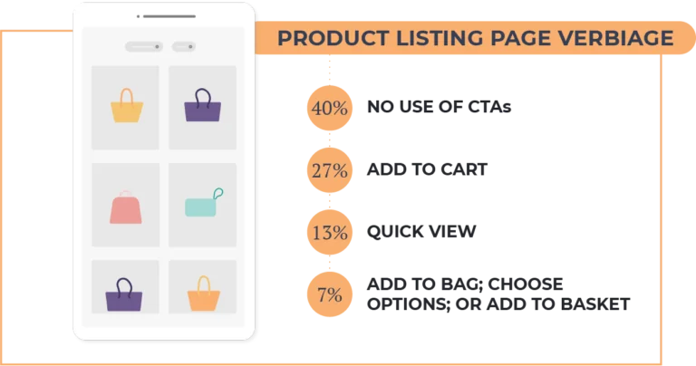
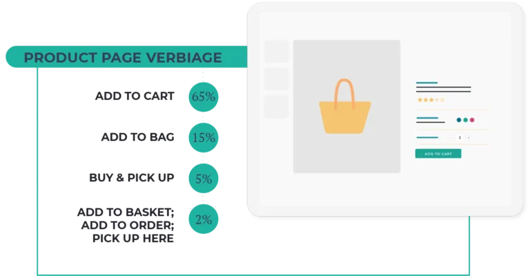
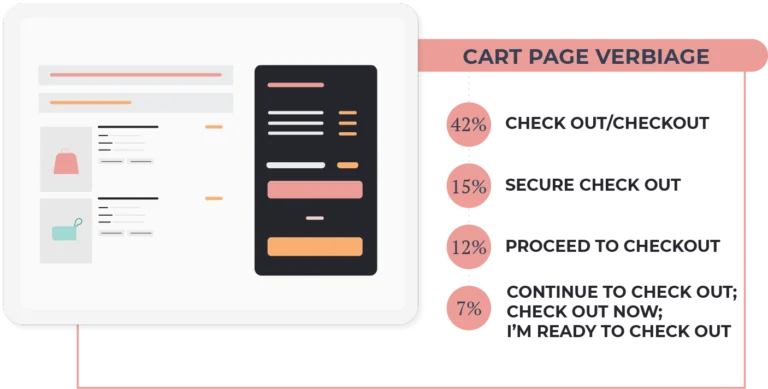
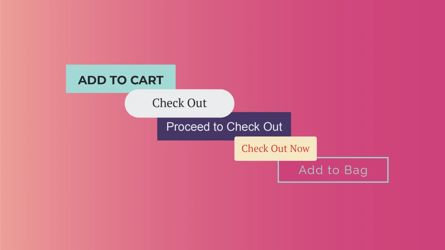
CTA Verbiage Breakdown
Choice of verbiage shouldn’t be an afterthought when it comes to CTAs. Clear, concise language can propel users to take the next step on your site; while confusing, long CTAs cause confusion and hesitation for users. Below, see the commonalities in verbiage choice on brand product listing pages, product pages, and cart pages.