
Case Study: Checkout Redesign
A reimagined checkout design leads to an increase in conversion rate
Checkout Redesign Test
Leading Glasses Company
Industry: Glasses
Location: Dallas, TX
Size: 12,000 employees
(Company name has been omitted to honor our partner’s privacy.)
About
Reimagined Checkout Experience
This client wanted Trinity to look into ways to help improve the design and functionality of their checkout to reduce bounce rate and improve the overall conversion rate on the website.
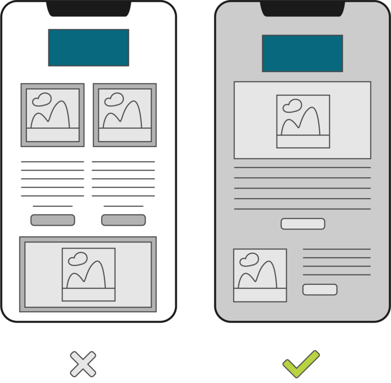
To achieve this, Trinity utilized our standard qualitative and quantitative efforts to decide on the best areas to improve within the checkout. We set up heat-maps to provide data into how users were scanning the checkout, which leveraged our optimal decision making. After designing a new checkout, Trinity A/B tested both to see which performed better.
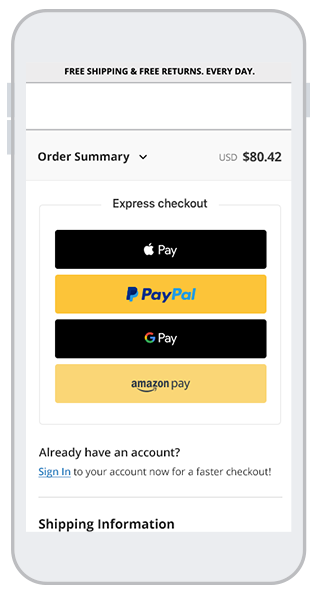
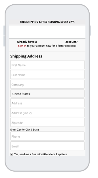
Website Control
Website Variation
Results
0
%
increase in phone calls
The test confirmed that this client’s checkout was due for an improvement. The new checkout design led to an overall conversion rate increase of 5% on both tablet and mobile devices (desktop increased slightly).
Now, this client not only benefits from increased revenue, but they also have a more modern and up-to-date checkout design that follows standard design and UX best practices. This makes the checkout experience much more streamlined and user friendly.
What Our Partners Are Saying
“Since our full web launch two weeks ago, we have far exceeded our revenue and traffic goals without any major defects, outages, or issues with site performance. The launch has drawn coverage from over 40 media stories, including several national publications. None of this would have been possible without the thorough development and testing of the website by Trinity and their unfailing commitment to our vision and requirements.”
Matt Owens | Strategic Initiatives Manager
Unclaimed Baggage
Ready to learn more?
Whether you’re a little interested or totally in, we’re here to help.